
Android gives you a rich set of built-in UI components, but every so often one of them doesn't behave the way you need. The standard Checkbox had a persistent click-registration issue inside list views — the animation would play but the state wouldn't update. Rather than working around it, I built a replacement from scratch by extending View directly. Here's how.
## Project Setup
Create a new Android Application project with an Empty Activity in Android Studio.
## The Base Class
Start by creating MaterialCheckbox, extending View and wiring up the three constructors:
package com.github.angads25.customviewdemo;

import android.content.Context;
import android.graphics.Canvas;
import android.support.annotation.Nullable;
import android.util.AttributeSet;
import android.view.View;

public class MaterialCheckbox extends View {
    private Context context;

    public MaterialCheckbox(Context context) {
        super(context);
        initView(context);
    }

    public MaterialCheckbox(Context context, @Nullable AttributeSet attrs) {
        super(context, attrs);
        initView(context);
    }

    private void initView(Context context) {
        this.context = context;
    }

    @Override
    protected void onDraw(Canvas canvas) {
        super.onDraw(canvas);
    }

    @Override
    protected void onMeasure(int widthMeasureSpec, int heightMeasureSpec) {
        super.onMeasure(widthMeasureSpec, heightMeasureSpec);
    }
}
## Measuring: Forcing a Square
A checkbox should always be square. Override onMeasure to take the smaller of the two dimensions and apply it to both:
private int minDim;

@Override
protected void onMeasure(int widthMeasureSpec, int heightMeasureSpec) {
    super.onMeasure(widthMeasureSpec, heightMeasureSpec);
    int width = getMeasuredWidth();
    int height = getMeasuredHeight();
    minDim = Math.min(width, height);
    setMeasuredDimension(minDim, minDim);
}
## State and Paint
Add checked state tracking and a Paint object in initView:
private boolean checked;
private Paint paint;

private void initView(Context context) {
    this.context = context;
    checked = false;
    paint = new Paint();
}

public boolean isChecked() {
    return checked;
}

public void setChecked(boolean checked) {
    this.checked = checked;
    invalidate();
}
Note
Calling invalidate() in the setter tells the framework to redraw the view with the new state.
## Drawing the Checkbox
### Unchecked state
Draw a grey rounded rectangle, then a white inner rectangle to create the border effect:
private RectF bounds;

// inside onDraw, unchecked branch:
paint.reset();
paint.setAntiAlias(true);
bounds.set(minDim / 10, minDim / 10,
           minDim - (minDim / 10), minDim - (minDim / 10));
paint.setColor(Color.parseColor("#C1C1C1"));
canvas.drawRoundRect(bounds, minDim / 8, minDim / 8, paint);

bounds.set(minDim / 5, minDim / 5,
           minDim - (minDim / 5), minDim - (minDim / 5));
paint.setColor(Color.parseColor("#FFFFFF"));
canvas.drawRect(bounds, paint);
### Checked state
Draw a coloured rounded rectangle (using colorAccent from your theme), then overlay the tick path:
// checked branch:
paint.reset();
paint.setAntiAlias(true);
bounds.set(minDim / 10, minDim / 10,
           minDim - (minDim / 10), minDim - (minDim / 10));

if (Build.VERSION.SDK_INT >= Build.VERSION_CODES.M) {
    paint.setColor(getResources().getColor(R.color.colorAccent, context.getTheme()));
} else {
    paint.setColor(getResources().getColor(R.color.colorAccent));
}
canvas.drawRoundRect(bounds, minDim / 8, minDim / 8, paint);

paint.setColor(Color.parseColor("#FFFFFF"));
paint.setStrokeWidth(minDim / 10);
paint.setStyle(Paint.Style.STROKE);
canvas.drawPath(tick, paint);
## Drawing the Tick Mark
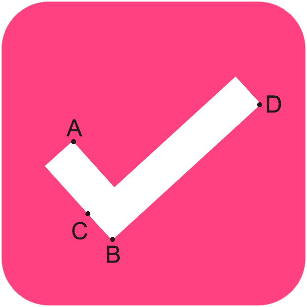
The tick is a Path built from two line segments. Construct it once in onMeasure after minDim is known:
private Path tick;

// in initView:
tick = new Path();

// in onMeasure, after minDim is set:
tick.moveTo(minDim / 4, minDim / 2);
tick.lineTo(minDim / 2.5f, minDim - (minDim / 3));
tick.moveTo(minDim / 2.8f, minDim - (minDim / 3.25f));
tick.lineTo(minDim - (minDim / 4), minDim / 3);
The path coordinates map to this layout — the first segment is the short downward stroke, the second is the long upward stroke:
## Checked/Unchecked States
Here is what the two states look like side by side:

## Click Listener
Define an interface for state-change callbacks:
public interface OnCheckedChangeListener {
    void onCheckedChanged(MaterialCheckbox checkbox, boolean isChecked);
}
Wire it up in initView:
private OnCheckedChangeListener onCheckedChangeListener;

public void setOnCheckedChangeListener(OnCheckedChangeListener onCheckedChangeListener) {
    this.onCheckedChangeListener = onCheckedChangeListener;
}

// inside initView:
OnClickListener onClickListener = new OnClickListener() {
    @Override
    public void onClick(View v) {
        setChecked(!checked);
        if (onCheckedChangeListener != null) {
            onCheckedChangeListener.onCheckedChanged(MaterialCheckbox.this, isChecked());
        }
    }
};
setOnClickListener(onClickListener);
## Using the View
### In XML
<com.github.angads25.customviewdemo.MaterialCheckbox
    android:id="@+id/checkbox"
    android:layout_width="32dp"
    android:layout_height="32dp"
    android:layout_margin="8dp" />
### In Java
MaterialCheckbox checkbox = (MaterialCheckbox) findViewById(R.id.checkbox);
checkbox.setOnCheckedChangeListener(new OnCheckedChangeListener() {
    @Override
    public void onCheckedChanged(MaterialCheckbox checkbox, boolean isChecked) {
        // isChecked is the new state
    }
});
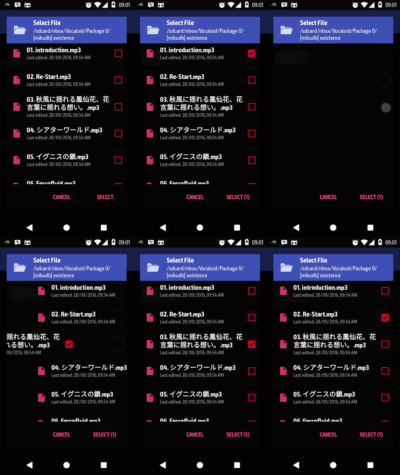
Here is a demo of the finished view in action:
The full source is on GitHub.